
As the recent Reddit commercials have made clear, there’s a community for everything. Nihilist horror, Game of Thrones’ Hodor, avocado food porn (because why not)…you can always find your people. Case in point, there’s a subreddit dedicated to atrocious user interfaces, which is now seeing members attempting to best each other by creating the worst UI designs possible.
The term is self-explanatory: A user interface is what allows you to interact with technology, from computers to McDonald’s kiosks to exercise equipment to, of course, video games. Some, like Elden Ring’s, are good. Most just get the job done. However, when you come across a bad UI, it’s like a painful hair in your eye and a sour taste in your mouth. Ubisoft games such as Assassin’s Creed Valhalla and Bungie’s Destiny have been derided for their cluttered and clunky interfaces, respectively. But the nightmares being dreamt up on Reddit definitely, albeit intentionally, take the rotten UI cake.
Thanks, these UIs make me hate it here
As spotted by Twitter user Aleksandr Volodarsky, engineers on the badUIbattles subreddit are scraping the bottom of the barrel to build the most annoying user interfaces ever. A forum for folks “[creating] bad UIs just for the sake of them being bad,” redditors are designing UIs that, if they were ever implemented IRL, would make you never want to interact with technology again. Take this one designed by redditor Lamamour last April, in which you have to funnel digits into a moving row of blocks to enter your phone number.
This “enter your phone number” concept has been iterated, tweaked, and worsened since Lamamour uploaded their initial atrocity. The latest entry by user NotYourBoii confronts you with a disordered drop-down menu that makes entering a phone number (twice, I might add) pure pain.
But what if you wanted to unsubscribe from a newsletter, YouTube channel, or some other subscription service? Well, you wouldn’t be able to with redditor OrangePrototype’s unsubscribe button, as a fan blows your cursor away.
Folks saw the challenge and wanted to make unsubscribing even worse, with user KountrySelektorXpert’s post asking that you tear through a 3D animated net to reach the cursed button.
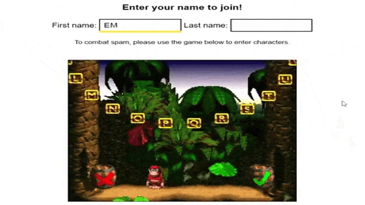
Entering your name is usually pretty easy when you have a keyboard, but leave it to these sickos to throw a wrench into things. Consider redditor IlluminatingEmerald’s Donkey Kong Country-inspired input method, which makes spelling your name truly suck.
Funnily enough, there hasn’t been much further competition in the name-entry arena. Still, while IlluminatingEmerald has probably created the worst of this type of UI thus far, redditor jordanE124567 submitted one that requires you to upload individual JPEGs of each letter.
There are so many aggravating user interfaces on that subreddit, with Volodarsky tweeting out some of the worst he’s found. For your viewing frustration—I mean, pleasure—here’s a little roundup of Volodarsky’s incredibly annoying findings.
All of these were purposely designed to be as irritating as possible, and thankfully, I can’t imagine any game developers taking inspiration from user interfaces meant to get on your nerves (unless it was intended as part of the gameplay experience, as in Getting Over It with Bennett Foddy or QWOP). That said, it’s hilarious seeing redditors doing their best to make the worst UI ever.


Leave feedback about this